
Table of Contents
A professionally formatted book ensures a seamless reading experience, maintains a visual hierarchy, and enhances the book’s overall appeal. Whether you’re self-publishing or preparing a manuscript for submission, attention to formatting can make a significant difference.
These are the 10 essential elements you need to keep when formatting you book professionally:

Key Elements for a Professionally Formatted Book
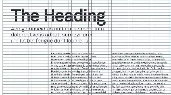
1. Consistent Page Margins to Create Balance
Margins may seem like a minor detail, but they play a huge role in how a book feels to the reader. Consistent page margins create a balanced layout, providing enough space around the text so that it doesn’t feel cramped or overwhelming. This breathing room is especially important in printed books, where tight margins can lead to uncomfortable reading. Good margins also ensure that words don’t get lost in the spine when the book is bound, making it easier for readers to flip through pages smoothly.
Beyond comfort, margins give the book a polished, professional look. Consistency in margin width—whether on the top, bottom, or sides—creates a visual harmony that’s easy on the eyes. It also allows the designer to place elements like page numbers, chapter headings, or footnotes consistently. This structural uniformity makes the book look well thought-out, boosting the reader’s trust in the quality of the content.
2. Choosing Readable Fonts and Effective Typography
The choice of font can greatly influence how readers experience your book. Readable fonts make the text easier to follow, keeping readers engaged with the story or content. Standard fonts like Times New Roman, Garamond, or Georgia are popular in print because they are familiar and easy on the eyes. For digital books, fonts like Arial and Verdana are better suited as they display clearly on screens. The goal is to choose a typeface that complements your book’s tone without distracting or straining the reader’s eyes.
Effective typography goes beyond just font selection; it includes font size, line spacing, and alignment. Choosing the right font size ensures the text is comfortable to read, while good line spacing gives each line of text enough breathing room. Consistent alignment—like justified or left-aligned text—helps create a uniform look that feels organized. When typography is done right, it fades into the background, allowing readers to focus fully on the content without unnecessary distractions.
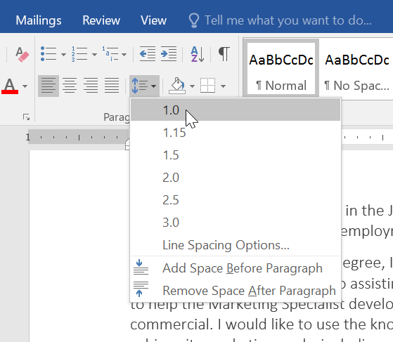
3. Setting Proper Line Spacing for Comfort
Line spacing, or the space between lines of text, directly affects how comfortably readers can engage with your book. If the lines are too close together, the text may feel cramped, causing eye strain and making it difficult to follow from line to line. On the other hand, if the spacing is too wide, the reading flow can feel choppy, pulling readers out of the story or information. Generally, a line spacing of around 1.15 to 1.5 for print books is ideal to maintain both readability and aesthetic balance.
Proper line spacing helps your book feel approachable and professionally designed. It allows readers to progress smoothly down the page, especially important in dense sections or when dealing with complex topics. Consistent line spacing also complements other design elements like font choice and margins, creating a cohesive and inviting look. Whether in print or digital format, thoughtfully set line spacing keeps the reader’s experience at the forefront, ensuring they stay engaged from start to finish.
4. Including Page Headers and Footers for Navigation
Page headers and footers are small but valuable tools that help readers stay oriented as they move through your book. By including elements like the book title, chapter title, or author’s name in the header, readers can easily find where they are, especially if they’re flipping through quickly. Footers are commonly used for page numbers, which are essential for organized navigation, whether for referencing specific content or simply keeping track of progress.
Well-designed headers and footers don’t just aid navigation; they add a subtle professional touch to the layout. Consistency is key—keeping these elements in the same position and style throughout the book maintains a clean, cohesive look that enhances the reading experience. When thoughtfully integrated, headers and footers become a practical guide, allowing readers to stay grounded in the book without detracting from the content itself.
5. Crafting Consistent Chapter Titles and Headings
Consistent chapter titles and headings bring structure and flow to your book, making it easy for readers to follow along. Clear, bold chapter titles signal transitions, helping readers know when a new topic or story segment begins. Choosing a uniform style—whether it’s font, size, or alignment—for chapter titles and headings throughout the book creates a cohesive, professional look that feels intentional and polished.
Besides aiding navigation, consistent headings make your book more visually appealing. A standard format for each chapter title or heading prevents a disjointed layout that can distract or confuse readers. Plus, for nonfiction books or instructional guides, having well-organized headings allows readers to quickly locate specific sections, making your book user-friendly and accessible.
6. Controlling Widows and Orphans for a Cleaner Look
Widows and orphans are terms used in typesetting to describe isolated lines of text that can make a page look fragmented and disrupt a reader’s flow. A widow is the last line of a paragraph stranded at the top of a new page, while an orphan is the first line of a paragraph left by itself at the bottom of a page. Both can be distracting and give an unbalanced look to your text.
To control widows and orphans, professional formatting tools (such as InDesign) offer options to adjust line breaks, spacing, and hyphenation to keep paragraphs and pages visually cohesive. This attention to detail contributes to a smoother reading experience and a polished, professional appearance that keeps readers engaged.
7. Utilizing Balanced White Space to Enhance Readability
White space, or the blank areas on a page, plays a crucial role in making a book visually inviting and easy to read. When used well, white space helps to separate text, images, and other elements, giving each part room to “breathe” and preventing the page from feeling overcrowded. This balance improves readability by guiding the reader’s eye naturally from one section to the next, reducing strain and enhancing overall comprehension.
Thoughtful white space also lends a professional feel to the layout, emphasizing important parts of the content without overwhelming the reader. Whether it’s around margins, between paragraphs, or surrounding images, balanced white space creates a clean, organized look that draws readers in. By allowing space on the page, you’re giving readers a more comfortable, enjoyable reading experience.
8. Using High-Quality Images and Graphics with Care
High-quality images and graphics can bring depth and visual interest to your book, especially if used to complement the content rather than distract from it. Clear, well-placed images help illustrate ideas, break up text-heavy sections, and keep readers engaged. However, it’s essential to ensure that each image is relevant and serves a purpose, as too many visuals or poorly chosen ones can make a book feel cluttered or unprofessional.
It’s also important to consider the technical quality of each image, especially for print books. Low-resolution images can appear blurry or pixelated, diminishing the book’s overall quality. Using images with appropriate resolution ensures that they look sharp and polished, whether on a digital screen or printed page. Thoughtfully integrated, high-quality images can enhance the reading experience, providing clarity and interest without overwhelming the content.
9. Applying Effective Paragraph Indentation for Consistency
Paragraph indentation is a subtle but powerful tool for creating a smooth reading flow. A consistent indentation style helps readers easily identify where new paragraphs begin, providing a visual cue that keeps the text organized. Whether you choose a traditional indent for each new paragraph or a space between paragraphs, the key is to apply it consistently throughout the book to create a polished, cohesive look.
Effective indentation also makes long blocks of text feel less overwhelming, breaking them into digestible pieces that guide the reader’s eye naturally down the page. By setting a clear, uniform indentation style, you give your book a clean, professional structure that’s easy for readers to follow, enhancing their overall experience without distracting from the content.
10. Aligning Text Correctly for a Polished Finish
Text alignment is a fundamental aspect of book formatting that can significantly impact the overall look and feel of your manuscript. The most common alignments are left-aligned, centered, and justified. Left alignment is generally the easiest to read, while centered alignment can be effective for titles and headings. Justified text, which creates a clean edge on both sides, offers a polished look but can lead to awkward spacing if not managed carefully. Choosing the right alignment based on the content and context is essential for maintaining a professional appearance.
Proper text alignment not only enhances visual appeal but also contributes to readability. When text is consistently aligned, it creates a structured layout that allows readers to navigate the content effortlessly. Avoiding misalignments or uneven edges prevents distractions that can pull readers out of the narrative. By paying attention to alignment, you ensure that your book has a cohesive and refined finish, making it more inviting and enjoyable for your audience.
If you’re feeling overwhelmed by the formatting process or aren’t sure you can tackle all these details, our team is here to help you achieve a polished, professional look for your book. Don’t hesitate to reach out to us for expert formatting services that will elevate your manuscript to the next level!
Final Thoughts
Formatting a book professionally is an essential step in elevating your manuscript and making it appealing to readers and publishers alike. By focusing on elements like consistent page margins, readable fonts, thoughtful line spacing, and effective use of white space, you create a comfortable reading experience that draws people in. Incorporating high-quality images, maintaining clear chapter titles, and aligning text correctly further contribute to a polished finish that speaks to the quality of your work.
Ultimately, the goal of proper formatting is to enhance your content without overshadowing it. A well-structured book not only reflects your dedication to your craft but also fosters a connection with your audience. By paying attention to these essential elements, you set the stage for success, ensuring that your manuscript stands out in a competitive market.

