
Visual hierarchy is a key element in book design that guides readers’ attention and enhances readability. By organizing text and images effectively, a well-thought-out hierarchy makes the content not only clearer but also more engaging. It ensures that readers flow naturally through the material, catching important points without feeling overwhelmed. In short, a good visual hierarchy brings structure and style together, making a book easier and more enjoyable to read.
2. Understanding the Basics of Visual Hierarchy
Visual hierarchy is a design strategy used to arrange elements in order of importance, guiding the reader’s attention naturally from one piece of information to the next. Its purpose is to enhance readability and ensure that key messages are seen first, creating a more intuitive and enjoyable reading experience.
Several factors shape visual hierarchy, including size, color, spacing, and font. Larger elements tend to draw more attention, while color can highlight or add contrast. Spacing gives the layout a balanced feel, making it easier on the eyes, and font choices set the tone, adding emphasis to important sections. Together, these elements create a well-structured design that leads readers smoothly through the content.
3. Typography Choices and Their Role in Visual Hierarchy
Typography plays a vital role in establishing visual hierarchy by helping guide the reader’s eye through the content in a logical order. Choosing the right font styles and sizes for headings, subheadings, and body text makes it easier for readers to differentiate between sections and understand the flow of information.
Headings are often larger and bolder to grab attention, while subheadings are slightly smaller to signal supporting information. Body text is usually simpler and smaller, ensuring readability without overwhelming the reader. By thoughtfully selecting typography, designers can create a natural reading path that enhances comprehension and engagement.
4. Balancing White Space for Optimal Readability
White space, or the empty space around elements, is essential for enhancing focus and readability. It gives the content room to breathe, reducing visual clutter and helping readers process information more easily. White space guides the eye and allows readers to rest between sections, improving comprehension and making the overall layout feel more inviting.
To use white space effectively, pay attention to margins, padding, and spacing between lines and sections. Generous margins create a clean border, padding around text blocks keeps content from feeling cramped, and ample line spacing improves readability. Together, these techniques make for a balanced, accessible design that’s easier to navigate.
5. Leveraging Color to Enhance Visual Flow
Color is a powerful tool in book design that enhances visual flow and reinforces the theme and mood of the content. By choosing colors that align with the book’s tone, designers create a more cohesive and immersive experience for readers.
Using contrast—like a bold color for headings or accents—draws attention to key areas and establishes a clear visual path. Subtle accent colors can highlight important points without overwhelming the main content, while careful use of contrast ensures that text remains readable. Thoughtful color choices help guide the reader’s eye smoothly and make the reading experience both engaging and enjoyable.
6. Designing Effective Headings and Subheadings
Effective headings and subheadings are essential for creating a clear hierarchy and helping readers navigate content easily. By using different heading levels, you can signal the structure of the information, making it clear where each section begins and ends. Larger or more prominent headings indicate main sections, while smaller subheadings break down supporting points within those sections.
Consistency is key: use a uniform style for each heading level to avoid confusion and maintain a clean, professional look. Clear, concise wording in headings also helps readers understand what to expect, keeping them engaged and making the content more accessible.
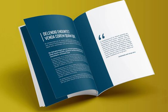
7. Integrating Images and Graphics with Visual Hierarchy
Integrating images and graphics effectively enhances visual hierarchy and supports the overall message of the text. When positioning images, it’s crucial to ensure they complement rather than overshadow the content. Images should be placed strategically, such as alongside relevant text or in close proximity to the information they illustrate, to reinforce key points without drawing attention away from the words.
Achieving a harmonious balance between visuals and content involves careful consideration of size, spacing, and placement. Ensure that images are appropriately scaled and have enough white space around them to prevent clutter. This balance allows the reader to absorb information without feeling overwhelmed, creating a cohesive and engaging reading experience.
8. Creating Consistent Layouts for a Cohesive Reading Experience
Maintaining consistent design throughout a book is vital for creating a cohesive reading experience. A uniform layout helps readers navigate the content more easily, allowing them to focus on the message rather than getting distracted by varying styles. Consistency builds familiarity, making it easier for readers to anticipate how information is presented.
To establish uniformity in layout, consider creating templates for different sections of the book. These templates should define key elements like margins, font sizes, heading styles, and spacing. By using these guidelines consistently, you can ensure that each page aligns with the overall design, making the book visually appealing and easy to follow. This structured approach enhances the reader’s experience and reinforces the professional quality of the work.
9. Testing and Refining the Design for Maximum Impact
Testing and refining the design is crucial for ensuring maximum impact and effectiveness. One key technique for reviewing the visual hierarchy is to evaluate readability and flow by assessing how easily a reader can navigate the content. This can be done by reading the material aloud, printing it out to see how it looks on paper, or using digital tools that simulate different viewing conditions.
Gathering feedback from peers, target readers, or design professionals can provide valuable insights. Encourage them to share their thoughts on clarity, engagement, and overall aesthetic appeal. Based on this feedback, be prepared to make adjustments—whether that means tweaking font sizes, rethinking color choices, or altering spacing. This iterative process helps optimize the design, ensuring it resonates well with readers and achieves the intended impact.
Ready to take your book to the next level? Don’t leave your design to chance! Invest in professional book formatting and design to ensure your content shines. Let us help you create a polished, visually appealing interior that captivates your readers and enhances their experience. Contact us today to learn more about our services and start your journey toward a beautifully designed book!
10. Conclusion: The Value of a Professional Book Design
In conclusion, visual hierarchy is a fundamental aspect of professional book design that significantly enhances readability and engagement. By thoughtfully organizing elements like typography, color, spacing, and images, you can create a clear and intuitive path for readers, making the content more accessible and enjoyable.
Investing in professional design not only elevates the aesthetic appeal of your book but also ensures that your message is communicated effectively. A polished interior design reflects your commitment to quality, helping to attract and retain readers. Ultimately, a well-designed book stands out in a crowded market, enhancing its chances of success and leaving a lasting impression on your audience.

